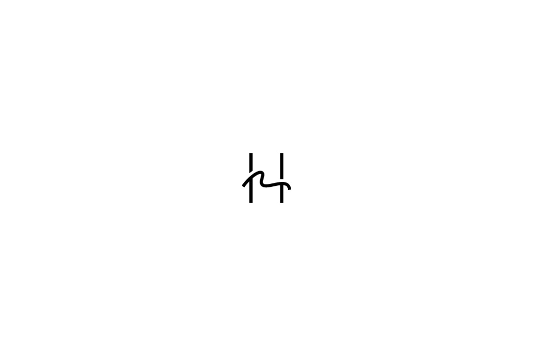
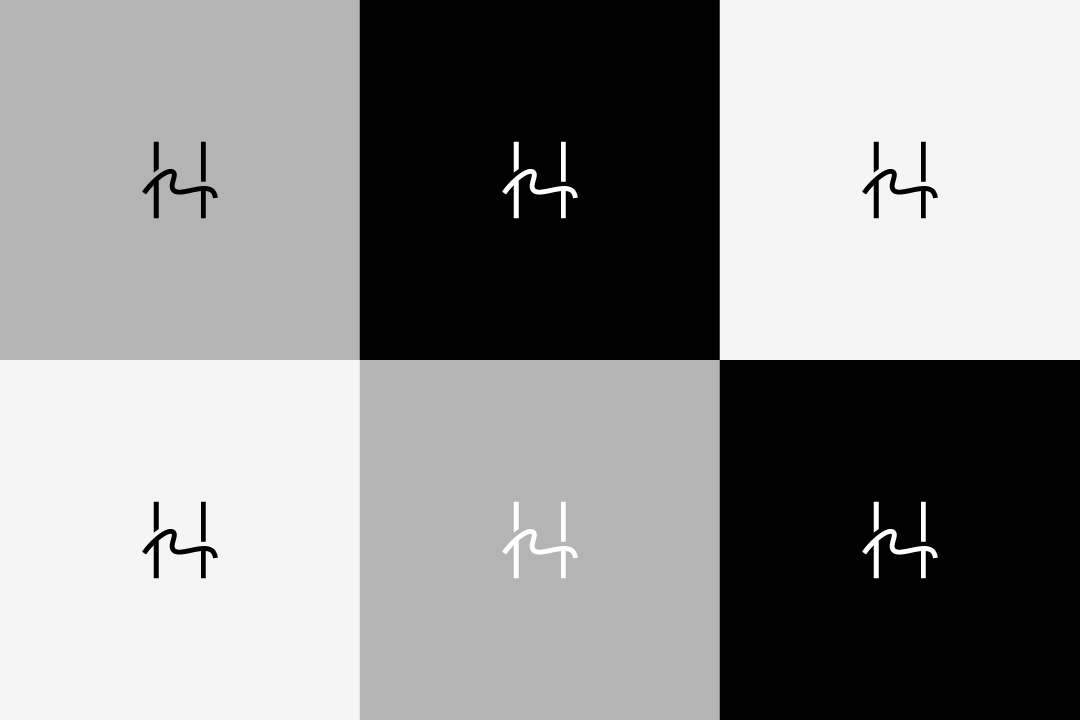
While reconstructing the corporate identity (CI) of Hidaka Washi, the logo design was created.
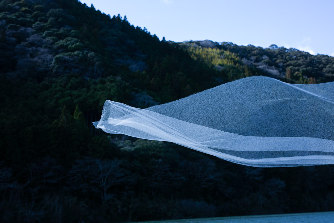
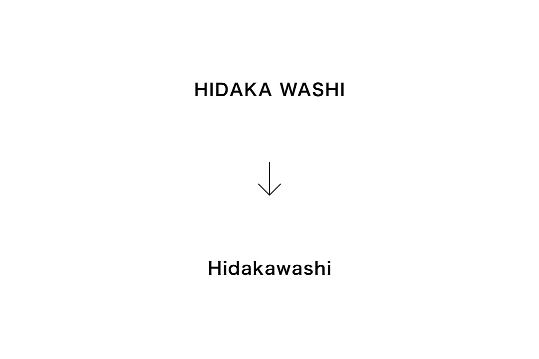
As a company that prides itself on producing the world's thinnest washi paper, the new brand name “Hidakawashi” was developed by combining the English words “HIDAKA” and “WASHI.” The symbol mark represents the harmony of tradition and innovation that Hidaka Washi embodies, aiming to further enhance the value of its products. Through this logo, Hidaka Washi's appeal will be communicated, with an eye toward new developments in both domestic and international markets.