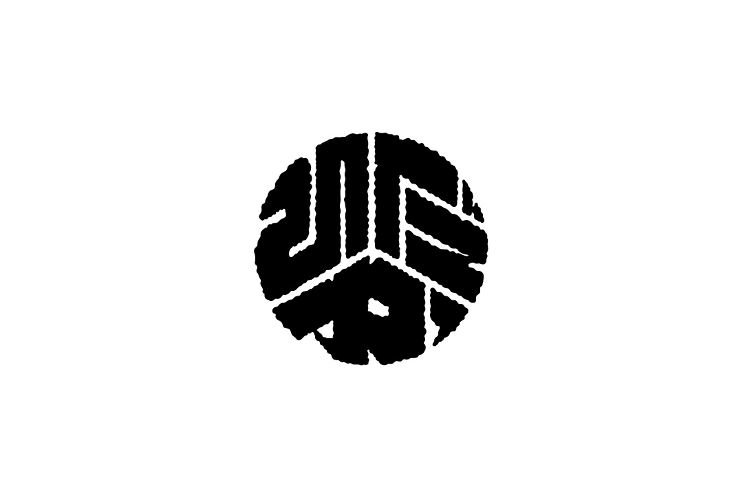
Hidakawashi BOTAN Monogram was created as part of the visual identity development for Hidakawashi, in response to the need for a versatile pattern that could be applied across various uses.
Inspired by traditional Botan-moji—a stylized lettering historically used in celebratory banners and signage—the design reinterprets its bold, decorative aesthetic with a contemporary graphic sensibility. The result is a monogram that both honors cultural heritage and expresses a modern visual language.
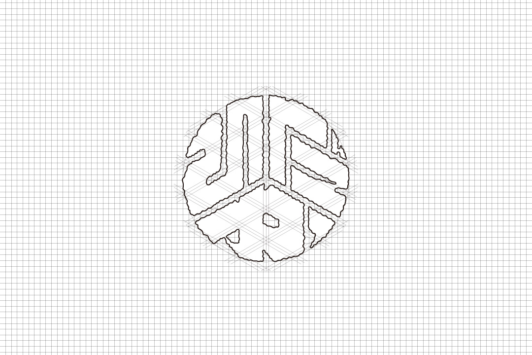
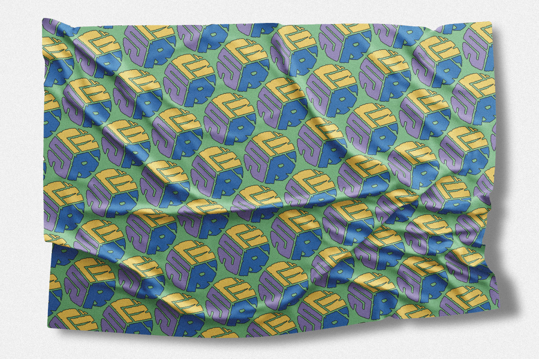
Its structure blends straight and curved elements, striking a balance between geometric order and organic softness. The pattern has been carefully composed to ensure visual rhythm and harmony when repeated, making it ideal for fabric, packaging, or paper goods.
The monogram is designed to be adaptable to a wide range of applications—from stationery and packaging to textiles—serving as a symbol that connects the tradition of handmade Japanese paper with forward-thinking design.